
Eye-Catching Resume Design Tips to Stand Out
Did you know recruiters look at a resume for just 7 seconds before deciding if they’ll consider you? In today’s job market, having a resume that grabs attention is key to getting your dream job. This article will give you expert advice on making a resume that highlights your skills and qualifications.
Creating a resume design that stands out is vital to catch potential employers’ eyes. By using visually appealing resume elements, you can stand out and show your professionalism. We’ll look at why visual appeal matters, the power of first impressions, and how to be noticed in a crowded job market.
These resume formatting and professional resume template tips are for everyone, whether you’re new to the job market or have years of experience. They’ll help you make a resume that really stands out.
Importance of Visual Appeal in Resumes
When it comes to resume design, how your resume looks is key to making a strong impression. In today’s job market, where employers are busy, a well-designed resume can make you stand out. It ensures your skills and qualifications get noticed.
First Impressions Matter
Your resume is often the first thing a hiring manager sees. The visual design of your resume can greatly affect their first impression of you. A clean layout, good font choices, and a smart color scheme make your skills and experiences look professional and memorable.
Standing Out in a Crowded Job Market
With many applicants for each job, a visually appealing resume can show off your skills and make you easy to spot. By focusing on the look of your resume, you can make a lasting impression. This increases your chances of being noticed and considered for the job.
| Key Factors for Visual Appeal | Importance |
|---|---|
| Resume Branding | Establishes a professional and memorable personal brand |
| Highlight Key Skills | Draws attention to your most relevant qualifications |
| Resume Readability | Ensures your resume is easy to scan and comprehend |
| Resume Font Choices | Conveys professionalism and sets the tone for your application |
| Resume Color Scheme | Enhances the visual appeal and reinforces your personal brand |
“The first impression is the last impression. A well-designed resume can make all the difference in a competitive job market.”
Choosing an Appropriate Resume Layout
Choosing the right layout for your resume can greatly impact how employers see your skills and experiences. The layout you pick sets the tone for your application. It also helps highlight your strengths and make your resume look good.
There are three main resume layouts: chronological, functional, and combination. The chronological resume layout puts your work history first, in reverse order. It’s great for those with a steady career path. The functional resume layout focuses on your skills and achievements, not your job history. It’s good for those with career gaps or switching industries. The combination resume layout mixes both styles, showing off your skills and work history.
| Resume Layout | Ideal For | Highlights |
|---|---|---|
| Chronological | Candidates with a consistent career progression | Work history in reverse-chronological order |
| Functional | Candidates with career gaps or changing industries | Skills and achievements over work history |
| Combination | Candidates with a mix of relevant skills and work experience | Blends elements of chronological and functional formats |
When picking a resume layout, think about your career history, job goals, and the job you want. Choosing the right professional resume template can really help your job search.
Branding Your Resume with Colors and Fonts
Making your resume stand out is more than just listing your skills. It’s about building a personal brand that speaks to potential employers. Using colors and fonts wisely can help you stand out in a busy job market.
Color Psychology in Resume Design
Colors can make people feel certain ways and send messages about who you are. When picking a resume color scheme, think about these color psychology tips:
- Blue: Shows trust, stability, and a professional look.
- Green: Means growth, balance, and caring for the planet.
- Red: Shows energy, passion, and confidence.
- Purple: Stands for creativity, new ideas, and a bit of luxury.
Font Choices that Convey Professionalism
The resume font choices you make help shape your personal resume branding. Pick fonts that are easy to read and match the job you want. Here are some top picks:
- Times New Roman: A classic serif font that looks professional.
- Calibri: A modern sans-serif font that’s polished but friendly.
- Helvetica: A versatile sans-serif font linked with minimalism and simplicity.
- Georgia: A serif font that’s a bit more casual but still looks good.
Your resume font choices and resume color scheme should work together. They should create a look that matches your career goals.
“The right mix of colors and fonts can turn a resume into something special.”
| Color | Psychological Association | Recommended Usage |
|---|---|---|
| Blue | Trustworthiness, stability, professionalism | Great for finance, law, or corporate jobs |
| Green | Growth, harmony, caring for the planet | Good for jobs in sustainability, health, or the environment |
| Red | Energy, passion, confidence | Use to highlight important parts or achievements, but be careful |
| Purple | Creativity, innovation, luxury | Right for jobs in the arts, design, or creative fields |
Highlighting Key Skills and Achievements
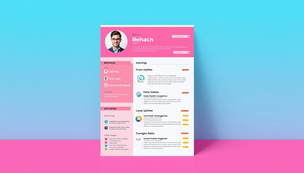
It’s key to make your resume stand out by showing off your main skills and big wins. Use things like icons or bars to highlight your top qualifications and achievements. This makes it clear why you’re a great fit for the job.
For your skills, think about adding a section that shows off your skills in a neat way. Use icons or bars to show how good you are at different things. This makes it easy for employers to see what you can do.
- Identify your most relevant and in-demand skills for the position you are applying for.
- Arrange your skills in a visually engaging manner, using icons or bars to convey your level of proficiency.
- Tailor your skills section to the specific job requirements, ensuring you emphasize the skills that are most valuable to the employer.
Don’t forget to show off your big wins too. This helps you stand out and shows how you’ve made a real difference. Use bullet points or a special section for your top achievements, like:
- Exceeded sales targets by 20% for three consecutive quarters.
- Implemented a new project management system that improved team productivity by 30%.
- Received a prestigious industry award for innovation in your field.
By focusing on your key skills and achievements, you make your resume grab the hiring manager’s attention. You’ll be the one who stands out from the crowd.
| Skill | Proficiency Level |
|---|---|
| Project Management | Expert |
| Data Analysis | Advanced |
| Strategic Planning | Proficient |
| Public Speaking | Intermediate |

“Highlighting your key skills and achievements on your resume is like putting a spotlight on your most valuable assets. It’s a strategic way to capture the attention of potential employers and demonstrate your unique value.”
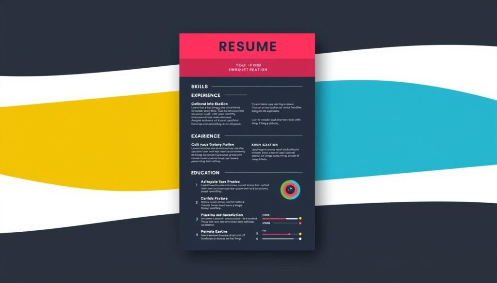
Resume Design Tips to Stand Out
Making your resume look good is key in today’s job market. To stand out, try these resume design tips:
- Leverage White Space Effectively – Use lots of white space to make your resume clean and easy to read. This makes important info pop.
- Utilize Visually Engaging Elements – Add icons, graphs, or other visuals to make your resume more interesting. They help show off your skills and qualifications.
- Maintain Consistent Formatting – Keep your resume looking professional by using the same font, size, and layout throughout. It looks polished and well-planned.
- Optimize for Readability – Write clearly and organize your resume so it’s easy to scan. This way, the most important info is easy to find.
Using these tips, you can make a resume that looks great and grabs attention. It will help you stand out and make a strong impression on employers.
“A well-designed resume can make a big difference in your job search. It’s a powerful tool that lets you show off your skills and achievements in a way that grabs attention.”
Maintaining Readability and Consistency
Creating a resume that catches the eye is key, but don’t forget about readability and consistency. Finding the right mix of looks and clarity makes it easy for employers to see your skills.
Balancing Visual Appeal with Clarity
It’s important to make your resume look good without losing the message. Use design elements that highlight your skills but don’t overdo it. Choose colors, fonts, and layouts that make your resume easy to read and focus on your best points.
Keep your resume clean and easy to scan. Use white space to make it look neat and tidy. Using the same font styles and sizes helps make your resume look professional and improves resume readability.
Your resume is often the first thing employers see. By balancing resume formatting with clear, concise writing, you can stand out. This shows off your skills and qualifications well.
“Consistency is key when it comes to resume design. Maintain a cohesive look and feel that reflects your personal brand and professional identity.”
Leveraging White Space for Better Legibility
Making your resume look good is more than just filling it up with info. Using white space wisely can make your resume clear and organized. This clean design makes it easy for hiring managers to see the important parts quickly.
Creating a Clean and Organized Layout
Good resume design is all about finding the right balance between content and white space. Leveraging white space helps focus the reader’s attention on key areas like your work history, skills, and successes. By placing resume layout elements thoughtfully and leaving enough space, your resume becomes easy to read and pleasing to the eye.
Here are some tips for a clean and organized resume layout:
- Use big margins and space between sections for a clear and easy read.
- Keep text aligned consistently, like left or center, for a neat look.
- Use bullet points, line breaks, and formatting to show off important info and create a clear order.
- Don’t pack too much onto the page to avoid a cluttered look.
By using white space well, you can make a visually appealing resume that’s easy for hiring managers to understand. This focus on detail can help you stand out in a busy job market and make a strong impression.
Tailoring Resume Design to Industry Norms
When making a resume template, think about what your industry likes and expects. Each field has its own way of doing things, especially with resumes. Matching your resume’s look with these standards can really help you stand out to employers.
The tech world likes a sleek, simple look, while finance and law prefer a classic, formal style. Looking at how others in your field present themselves can guide you. This way, your resume will speak to your audience and show you get what they’re looking for.
- Look at resumes from people in your field to see what’s common in terms of layout and style.
- Choose colors, fonts, and a look that matches the style of the companies you’re applying to.
- Make sure to include the right keywords, skills, and achievements that are important in your industry.
By making your resume template fit the industry, you’re making a document that really shows off your skills and sets you apart. This careful attention to detail can leave a strong impression. It can also boost your chances of getting the interviews you want.
| Industry | Typical Resume Design Preferences |
|---|---|
| Technology | Modern, minimalist layout; emphasis on skills and achievements; use of relevant keywords and technical jargon |
| Finance/Accounting | Traditional, formal design; clear organization and structure; focus on quantifiable accomplishments and financial metrics |
| Creative/Design | Visually striking, unique designs; inclusion of relevant portfolio samples or graphics; demonstration of creative problem-solving |
“Tailoring your resume design to industry norms is a strategic way to demonstrate your understanding of the expectations and preferences of your target employers.”
Tips for Formatting and Proofreading
Making your resume look good takes a lot of care. Make sure your resume is easy to read with clear headings, the right font sizes, and even spacing. Check your resume carefully to catch any mistakes that could hurt your professional look.
Avoiding Common Resume Design Mistakes
Watch out for resume mistakes like too much clutter, uneven formatting, or distracting graphics. A clean, readable resume makes your skills and achievements shine. By paying attention to how your resume looks and checking it for errors, you can make a strong impression on employers.
FAQ
What are the most important factors to consider when designing an eye-catching resume?
Important factors include making the layout visually appealing. Use strategic colors and fonts. Highlight your key skills and achievements. Keep the document readable and consistent.
How can I make my resume stand out among the competition?
To stand out, add visual elements like icons or bars to highlight your best qualifications. Use white space to keep the layout clean and organized. Tailor the design to fit industry norms and preferences.
What are the common mistakes to avoid when formatting and proofreading my resume?
Avoid inconsistent formatting, typos, and grammatical errors. Don’t let your layout get too cluttered. Also, steer clear of using fonts and colors that are not professional.
How can I choose the right resume layout and format for my experience and qualifications?
The right resume layout depends on your experience and the skills you want to highlight. Choose a format like chronological or functional. This will help showcase your strengths effectively.
What role do colors and fonts play in creating a professional and branded resume?
Colors and fonts can brand your resume and make it look polished and professional. Using color psychology and selecting the right fonts can boost your resume’s visual appeal.